Discord, a popular social media app, released a new mobile update on Dec. 5. While most previous updates simply fixed bugs or added small new features, this one was huge; along with “better search” and “faster launch time,” mobile users could now experience a brand new user interface (UI) that “feel[s] like it was optimized for your mobile device rather than a scaled-down desktop app.” The popular consensus with this update is that it’s terrible, simply because the new UI is unfavorable and too jarring for many mobile users. However, this UI seems to be overshadowing the real positives that this update bring to Discord and what the future of the app and its services may look like; the new Discord update is not that bad, it’s been blown way out of proportion.
The update was so big, the Discord team even made a specific branch to the website version of their app, discord.com/mobile, dedicated to highlighting and explaining this new update and its positives. The app has around 196.2 million monthly active users, with all mobile users being forced to use this new version. Many YouTubers would go one to make videos analyzing the UI brought on by the update, with some bashing the UI for its unnecessary changes. Supporters and other less critical creators would go on to ease the negatives and highlight changes in the update other than the UI, attributing the hate of the new UI to be a hate for sudden change rather than a supposedly objectively bad interface. YouTuber No Text To Speech summarized, in his video on the update, that people had four reasons for hating the new UI: muscle memory, some slowness and bugs, supposed strange behavior (more notably with new features), and the inability to go back to the previous version of the UI everyone is used to.
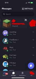
“The update is fine and well polished to be fair, but I generally prefer the previous UI,” junior Jason Lopez said. “Everything was simpler, on one screen, and though this new update is not that much more complicated, I would prefer if everything was on one screen. It’s not necessary to be arguing this much about the update, it’s not that bad. The new features sound pretty good, especially the Supercharged Search. After a long period of time, I think people, including me, will get used to this.”
On discord.com/mobile, the app’s team calls out specific changes with colorful graphics and text, attributing many of the changes, most notably bug fixes, to the feedback of the app’s users. Some of the notable changes include a search bar in the app’s settings to avoid needless scrolling when securing or optimizing one’s personal account. Included in this new update is also the “Supercharged Search,” a feature that allows one to find any specific text (usually a word or phrase) throughout one’s entire chatting history anywhere on the app.
Still many debate the need for some of the changes despite the positive, unprecedented features. One common gripe is what users need to do in order to see the members and details of their message group, server, or server channel. Instead of swiping left during any message conversation to see these details, one must now press the name of their conversation group to do so. The act of swiping left in a conversation group is now used for directly replying to a specific message, something that previously required holding and clicking a specific message rather than swiping. All of this is seen as unnecessary and annoying by many users.
New and debatable is also the split “Servers” and “Messages” tabs. Instead of a user having all their communications in one tab and accessible on one screen, DMs and servers are now split into separate tabs. Discord believes users “have lots of conversations going on at once” and separated these communications to “better organize these communications.” Included in the new messages tab is the ability to see what one’s friends might be doing, something that could only be done before by clicking another person’s profile (this can still be done). One may also favorite message groups so that they appear on the top of the screen upon opening the messages bar, something seen in many other social media and messaging services.
Along with more general improvements like faster launch time and greater stability on the app (less crashing), it also introduced “Midnight theme.” Discord, as well as many other social media apps, already gave users the option to switch from the default light mode/theme (white background with black text) to the less eye straining dark mode/theme (dark background with bright text), yet Discord introduced something even darker. Since many users enjoy the comfort of dark theme, Midnight theme was brought on, making the app’s background completely black to save more battery and to be even less straining on the eyes.
Discord’s new update is often given harsh criticism for the new UI that the update introduced. However, it is important to not that the UI on non-mobile devices have not changed and that the new features in this update (like Supercharged Search and a search bar in the user settings) are often overlooked and improve the app dramatically. The app is now so much more convenient with these features and users can still do everything they had and wanted to, it just might require a different action than before. The future of Discord looks bright with these new features, and perhaps in a couple months, everyone will be so used to the new UI that muscle memory adjusts and everyone will forget how supposedly terrible this update was.






Sean • Jun 5, 2024 at 12:01 am
I think the way you have to tape the channel name to see the roles and not haveing it by the side I liked the old way this new way annoys me especially when I a, working on stuff so discord change BACK please.